SIN ST BBQ
Food Truck Brand Identity
Art Direction / Advertising / Design / Illustration
2020
SIN ST BBQ
Food Truck Brand Identity
Art Direction / Advertising / Design / Illustration
2020
SIN ST BBQ
Food Truck Brand Identity
Art Direction / Advertising / Design / Illustration
2020
SIN ST BBQ
Food Truck Brand Identity
Art Direction / Advertising / Design / Illustration
2020
SIN ST BBQ
Food Truck Brand Identity
Art Direction / Advertising / Design / Illustration
2020
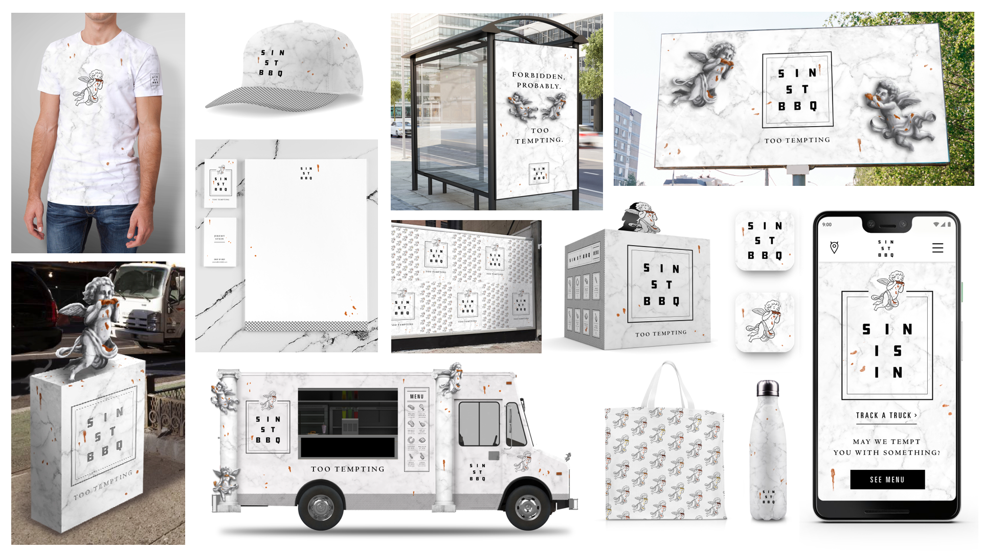
SIN ST BBQ is a branding proposal for a barbecue food truck concept, where the food is so tempting, it can’t not be a sin. My goal was to create an experience that impacted the viewer no matter the medium they were interacting with. A storytelling wrapper that could extend anywhere and disrupt the consumer mindset of that category.
SIN ST BBQ is a branding proposal for a barbecue food truck concept, where the food is so tempting, it can’t not be a sin. My goal was to create an experience that impacted the viewer no matter the medium they were interacting with. A storytelling wrapper that could extend anywhere and disrupt the consumer mindset of that category.
SIN ST BBQ is a branding proposal for a barbecue food truck concept, where the food is so tempting, it can’t not be a sin. My goal was to create an experience that impacted the viewer no matter the medium they were interacting with. A storytelling wrapper that could extend anywhere and disrupt the consumer mindset of that category.
SIN ST BBQ is a branding proposal for a barbecue food truck concept, where the food is so tempting, it can’t not be a sin. My goal was to create an experience that impacted the viewer no matter the medium they were interacting with. A storytelling wrapper that could extend anywhere and disrupt the consumer mindset of that category.
SIN ST BBQ is a branding proposal for a barbecue food truck concept, where the food is so tempting, it can’t not be a sin. My goal was to create an experience that impacted the viewer no matter the medium they were interacting with. A storytelling wrapper that could extend anywhere and disrupt the consumer mindset of that category.
Client
Personal
Agency
Self
Role
Creative Director
Client
Personal
Agency
Self
Role
Creative Director
Client
Personal
Agency
Self
Role
Creative Director
Concept Sketchbook
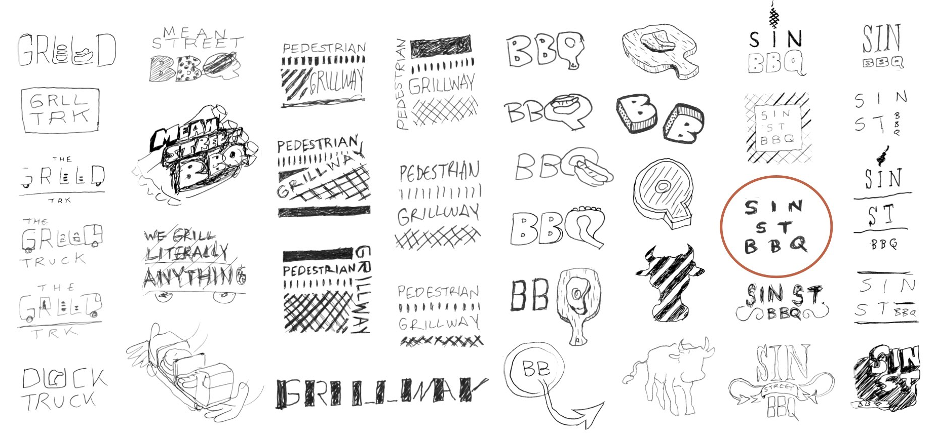
Sketching is a fundamental part of my process and general philosophy towards life. It’s the fastest way to prove concept and move on. In this phase you just need to let the sketches organically lead you from theme to theme. Eventually through iteration you will land on something and then bring it into a full typography exploration.
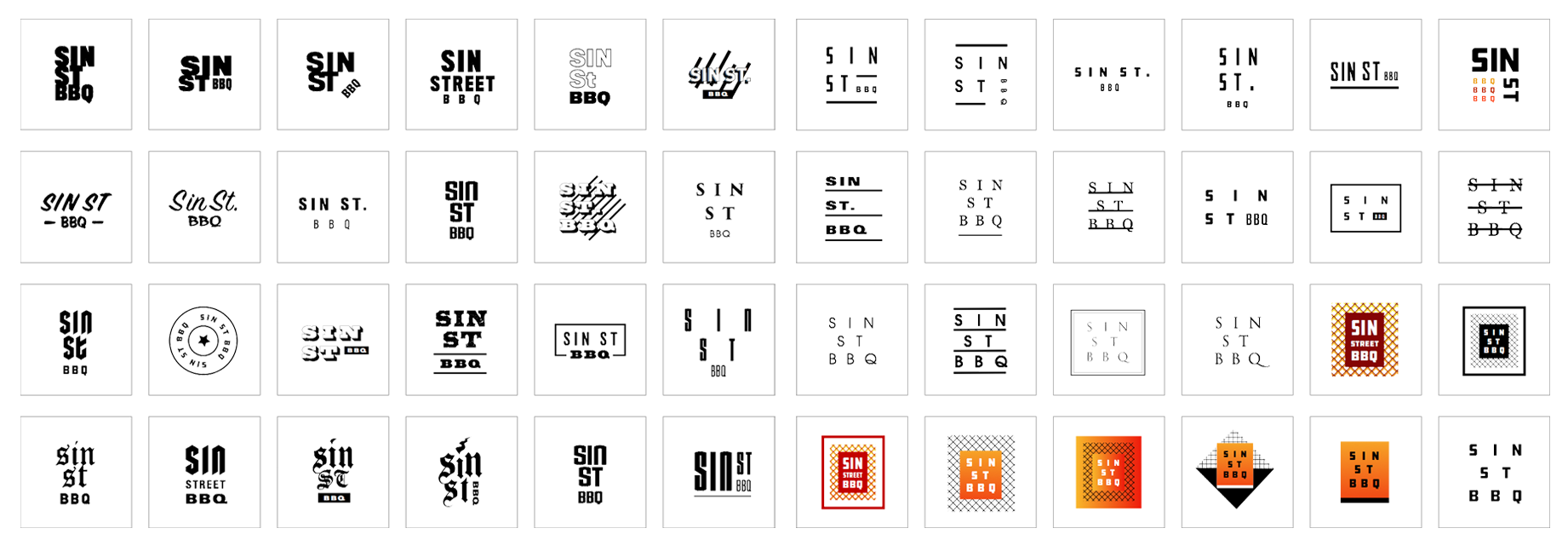
Logo System Exploration
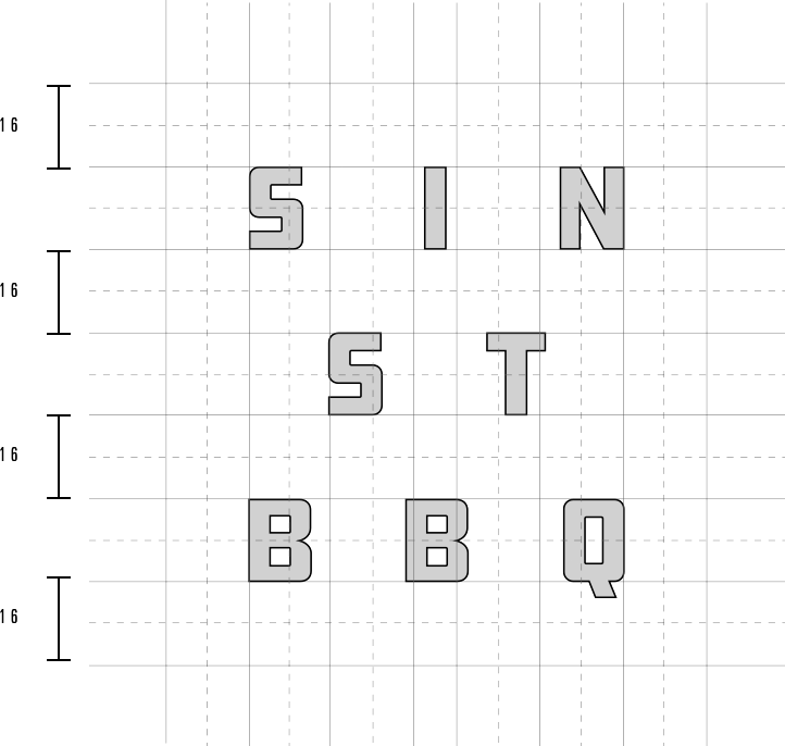
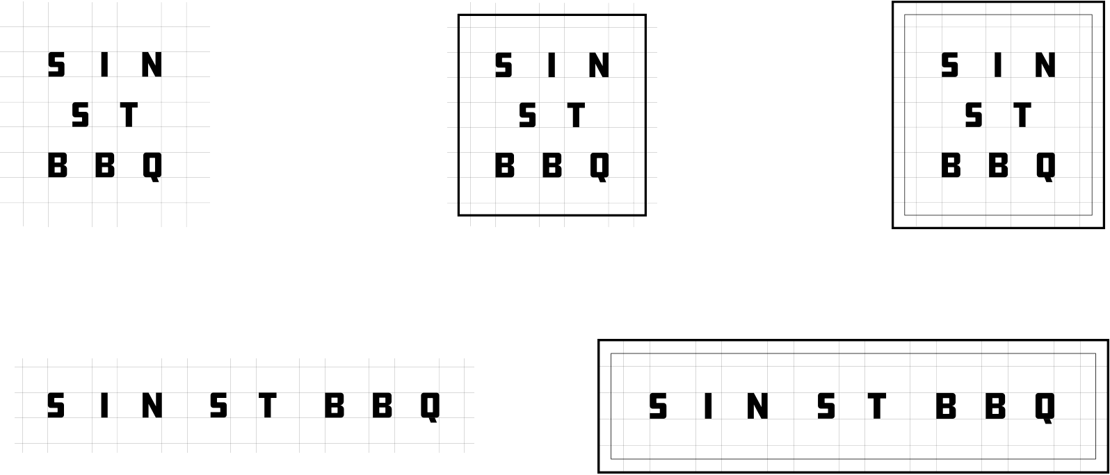
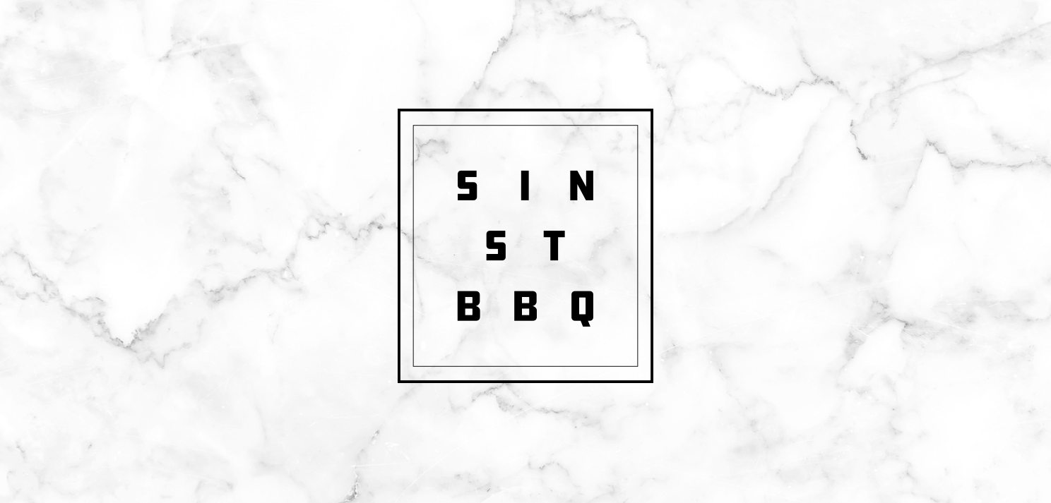
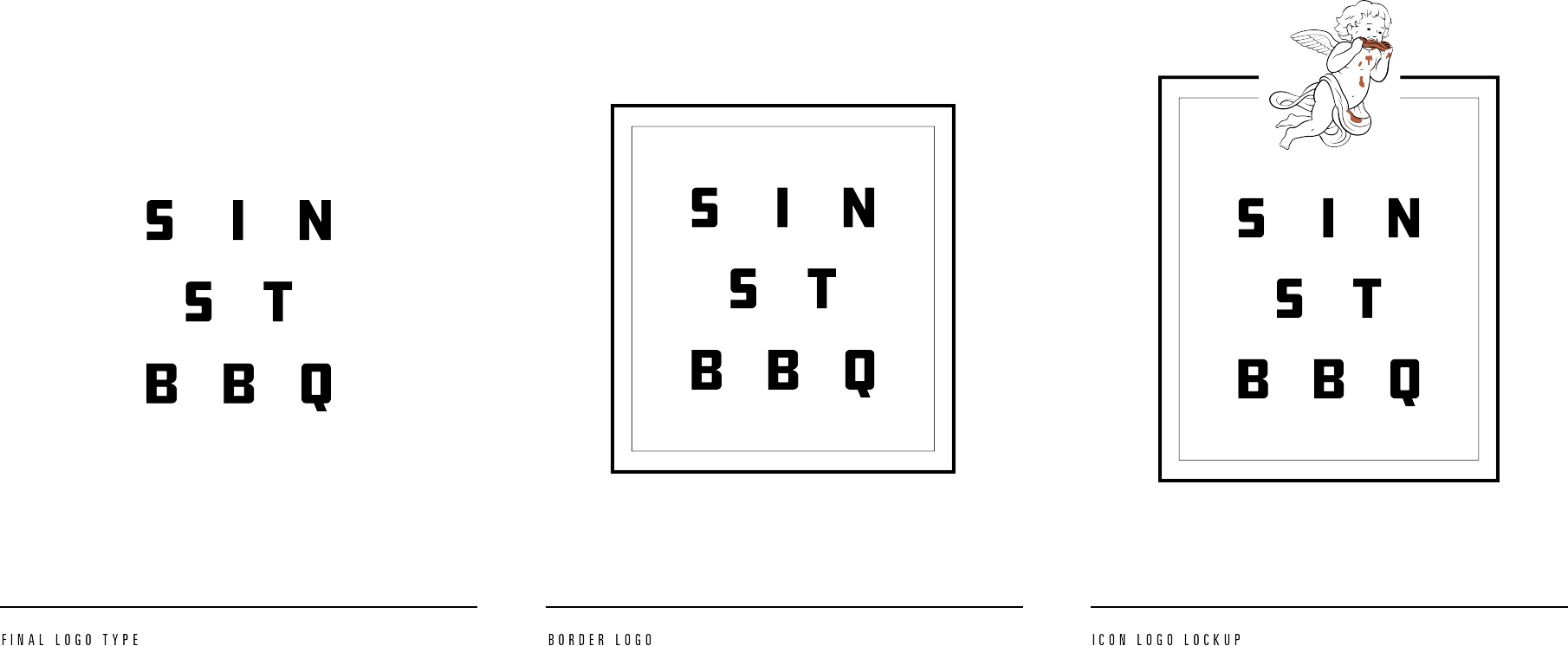
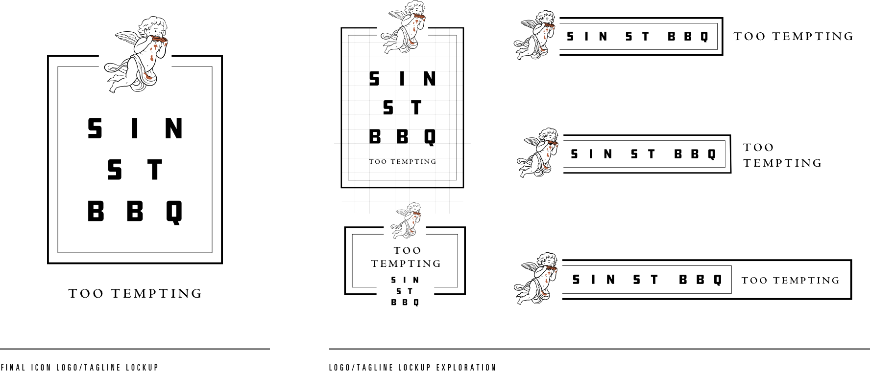
I landed on this logo mark in the end because it's abalance between the symmetrical Roman design motifs inherent to the core concept and the bold type style of modern barbecue branding trends. Additionally, aside from it being symmetrical and structurally solid, it has good bones to develop a system that accommodates for relevant extensions and potential activations.
Brand Icon
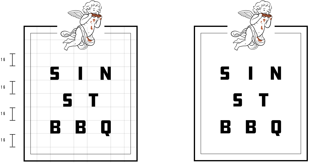
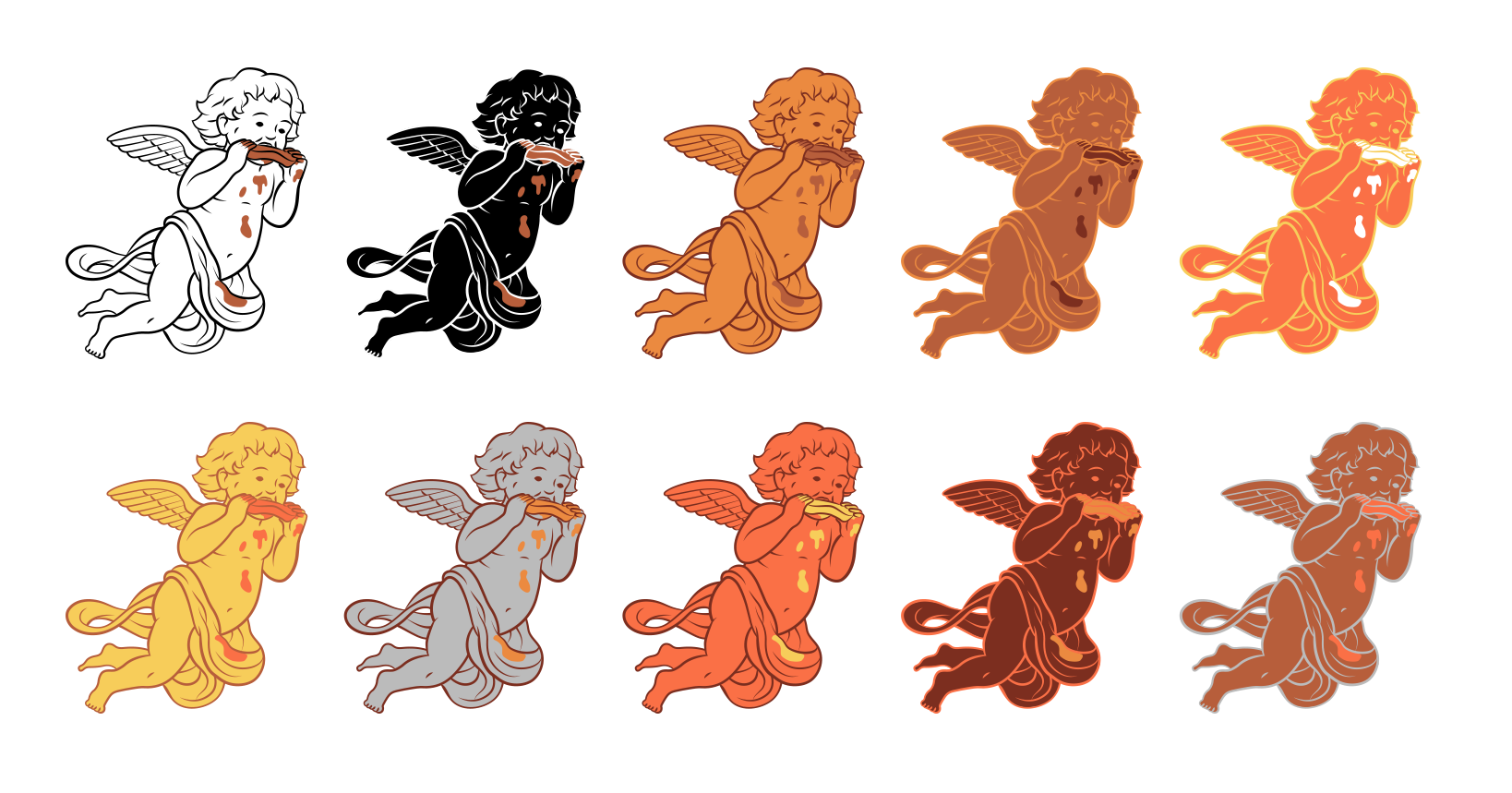
The “barbecue cherub”, as I came to call it, embodies the pure, pristine aesthetic, subverted by messy barbecue sauce drips. The cherub is the only brand element that leverages color, showcasing it through the sauce drips. It was illustrated in a vector brush style that feels controlled but still has some varying stroke weight to make it feel a bit more organic.
Brand Voice
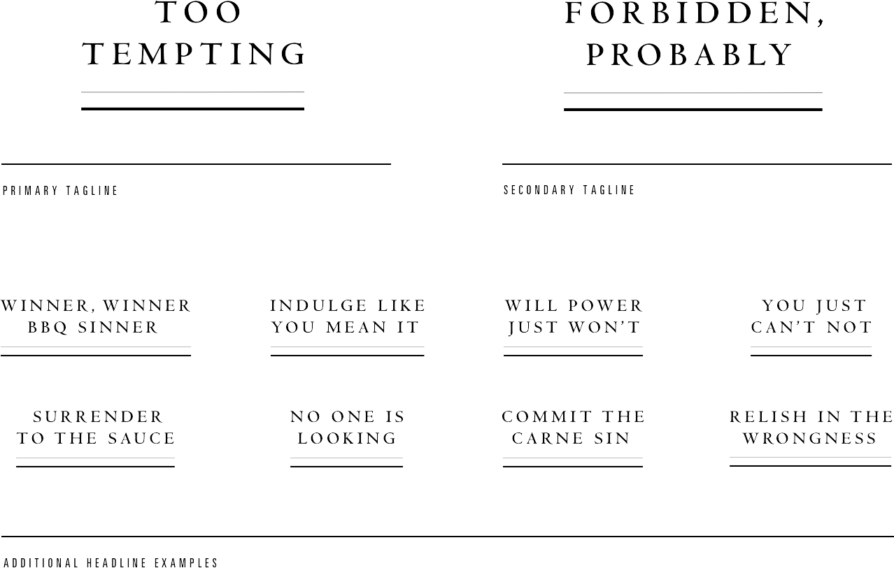
A brand’s voice is one of its most powerful weapons and now that the brand had a crafted personality, it was time to hear it speak. “Too Tempting” perfectly captured the character of the brand and this became the primary brand tagline. This was followed by a secondary tagline “Forbidden Probably” which seemed like an organic compliment to the primary. Like an interchangeable messaging system.
Brand Iconography
As the system continued to develop, I extended the icon illustration style to an iconography set for use across the entire brand gamut, in print on menus and packaging, in digital on the app or in a brand tapestry. They can be used for functional and decorative purposes. Here I show how I go from light pencil sketches to finished vector.
All of the icons were designed in a 24 x 24 pixel grid for spacial consistency across all mediums and stylistically allude to the brand icon in terms of organic stroke weight.
All of the icons were designed in a 24 x 24 pixel grid for spacial consistency across all mediums and stylistically allude to the brand icon in terms of organic stroke weight.
Color Pallette
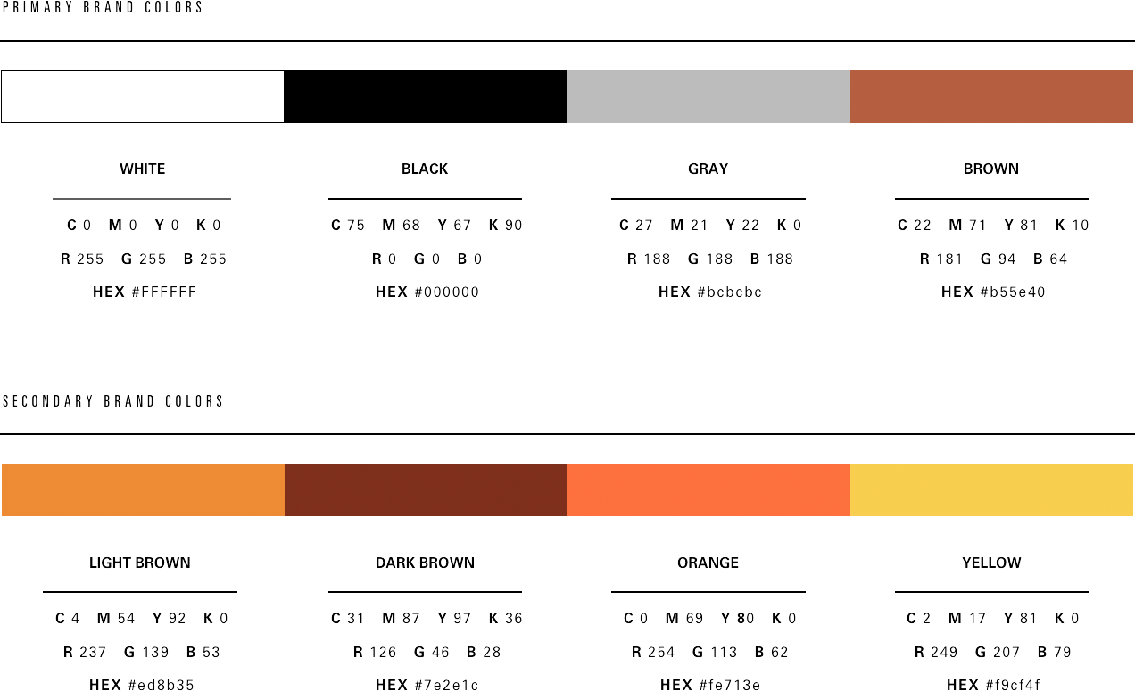
Color isn’t used much in this brand but when color is used it is used sparsely and purposefully. The colors allude to the sauces used in barbecue as well as a general barbecue ingredients.
Color Pallette
Color isn’t used much in this brand but when color is used it is used sparsely and purposefully. The colors allude to the sauces used in barbecue as well as a general barbecue ingredients.
Brand Icon Tapestries
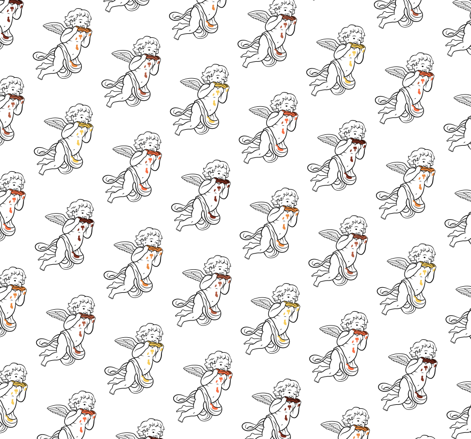
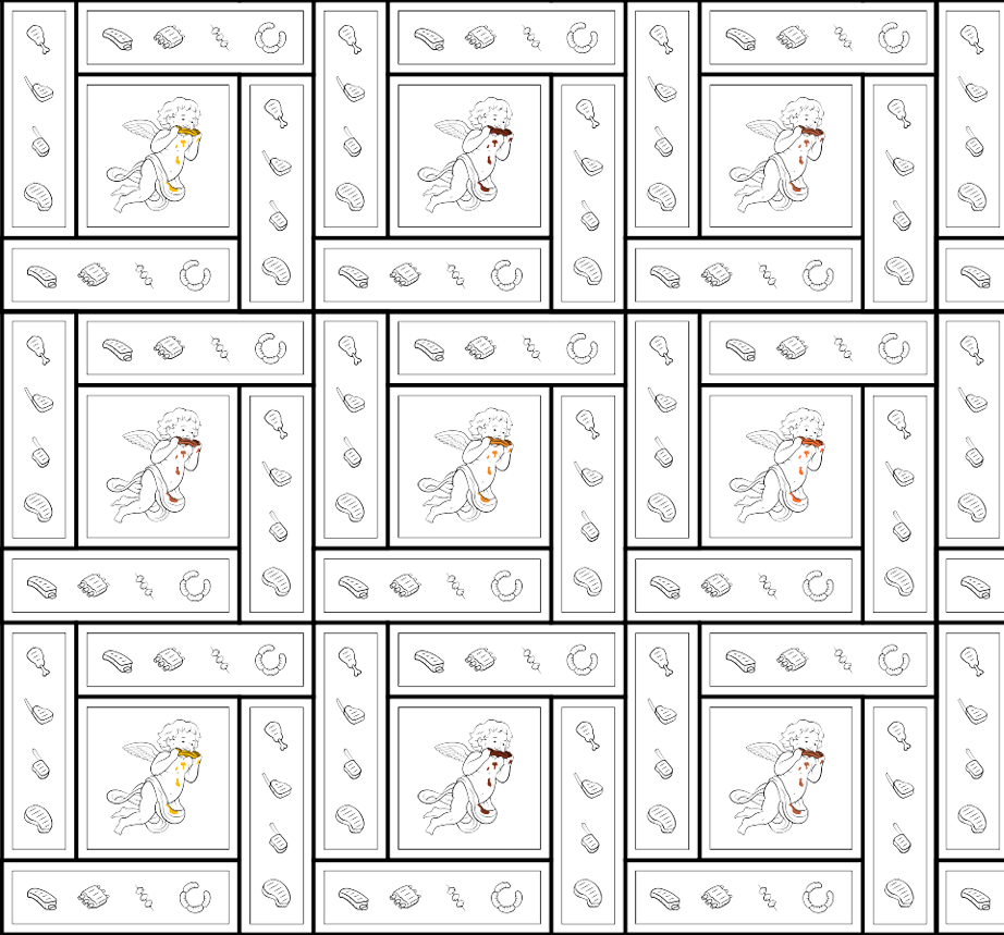
Patterning brand icons is a great way to explore the texture of a brand identity. Repetition allows branding to take on new life and weave numerous elements together. We can see the brand color palette come into play here as well. Tapestries tell their own stories.
Brand Icon Tapestries
Patterning brand icons is a great way to explore the texture of a brand identity. Repetition allows branding to take on new life and weave numerous elements together. We can see the brand color palette come into play here as well. Tapestries tell their own stories.
Modular Menu System
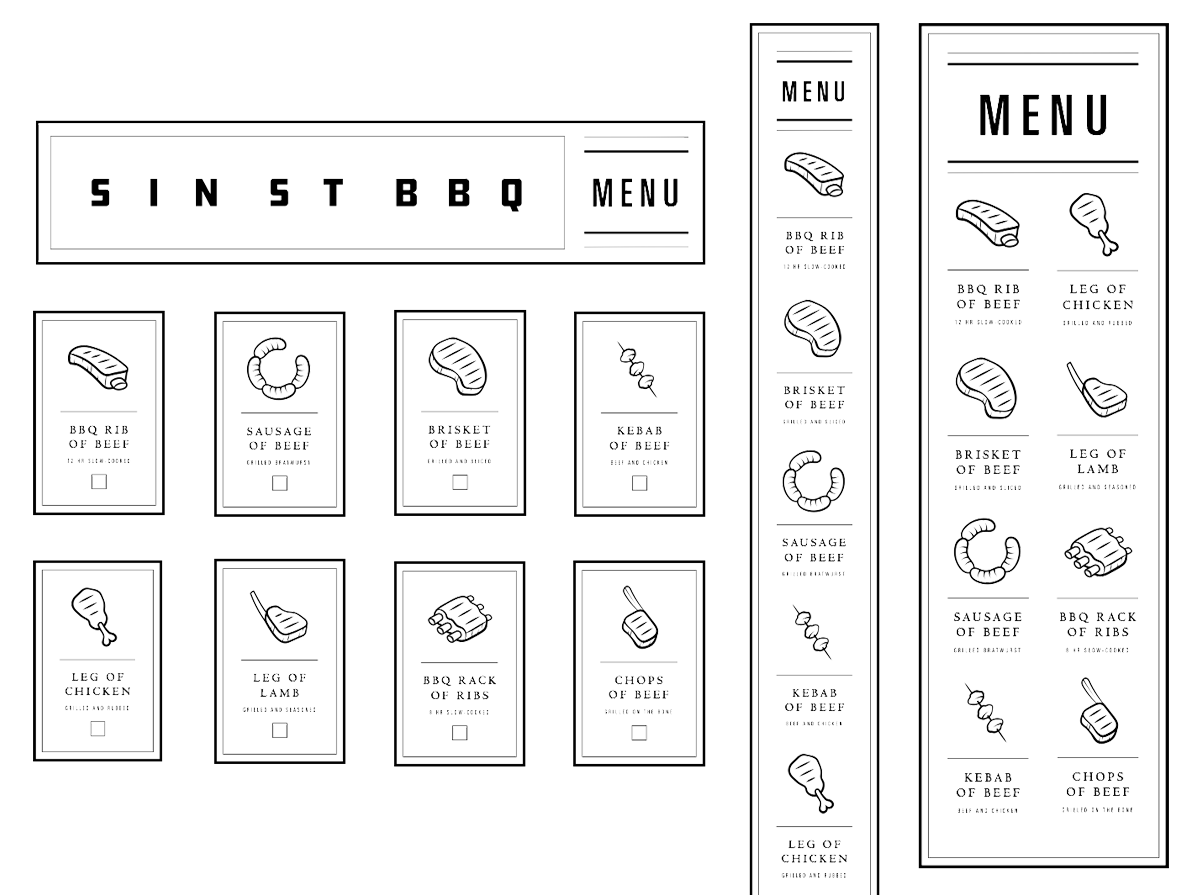
Acting similar to a responsive website across different breakpoints, the menu design is meant to be as versatile as possible in order to work gracefully in both physical and digital mediums. This includes packaging, signage and the mobile app.
Modular Menu System
Acting similar to a responsive website across different breakpoints, the menu design is meant to be as versatile as possible in order to work gracefully in both physical and digital mediums. This includes packaging, signage and the mobile app.
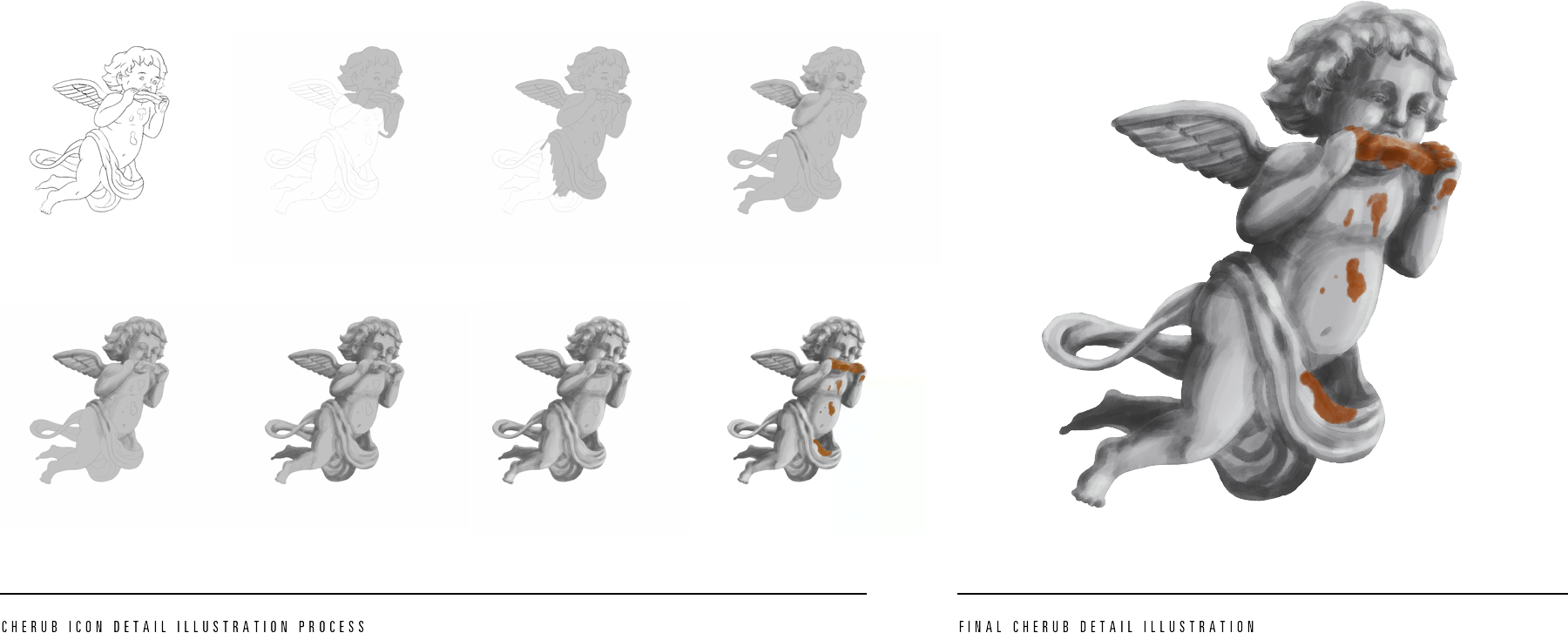
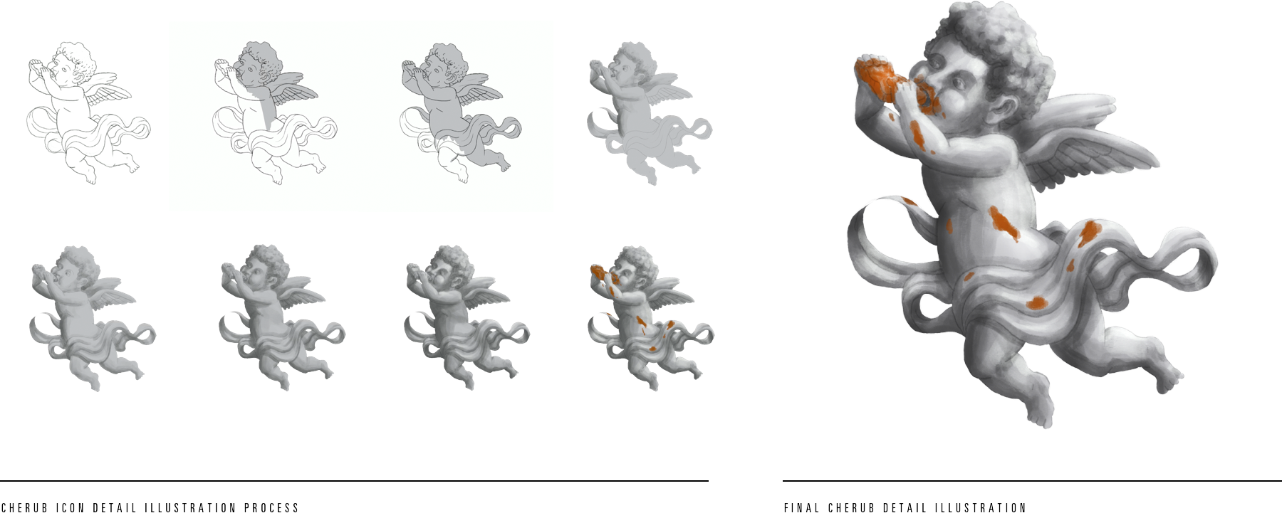
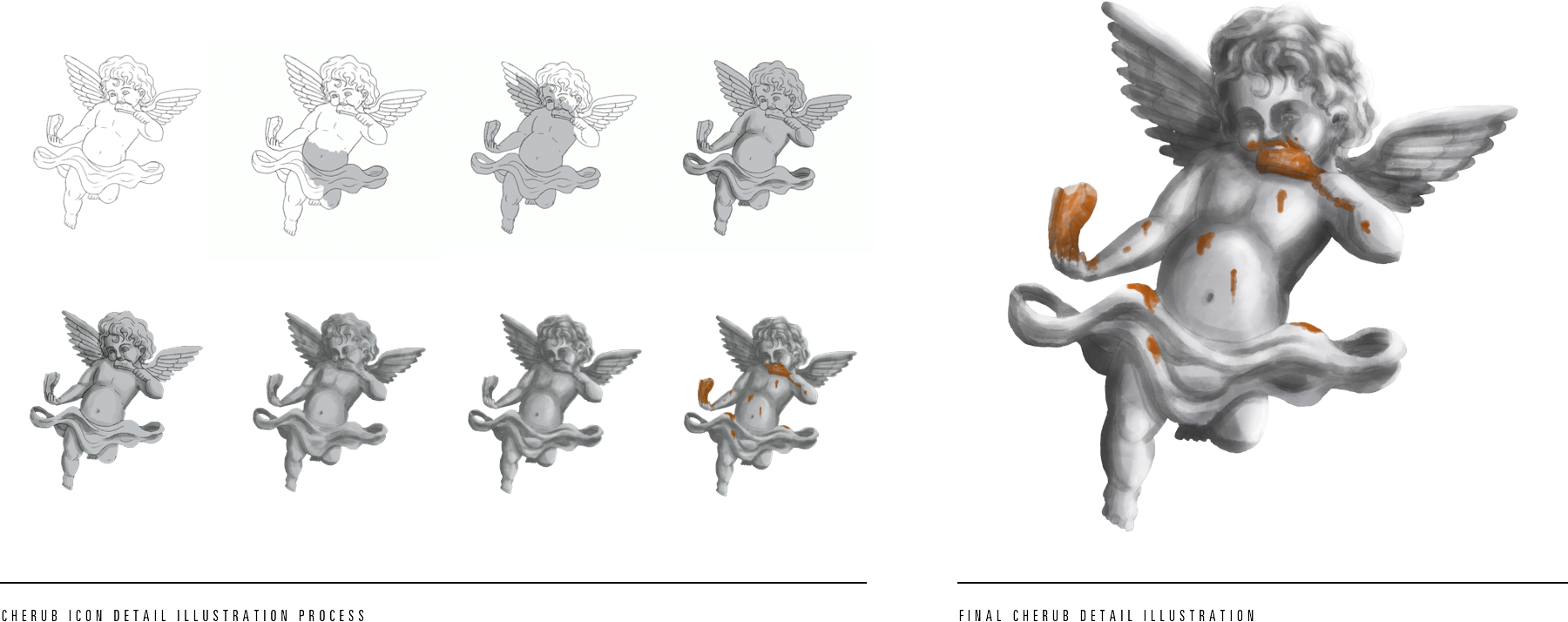
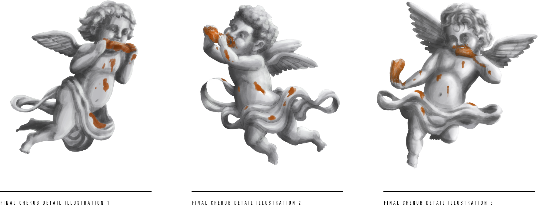
Cherub Detail Illustrations
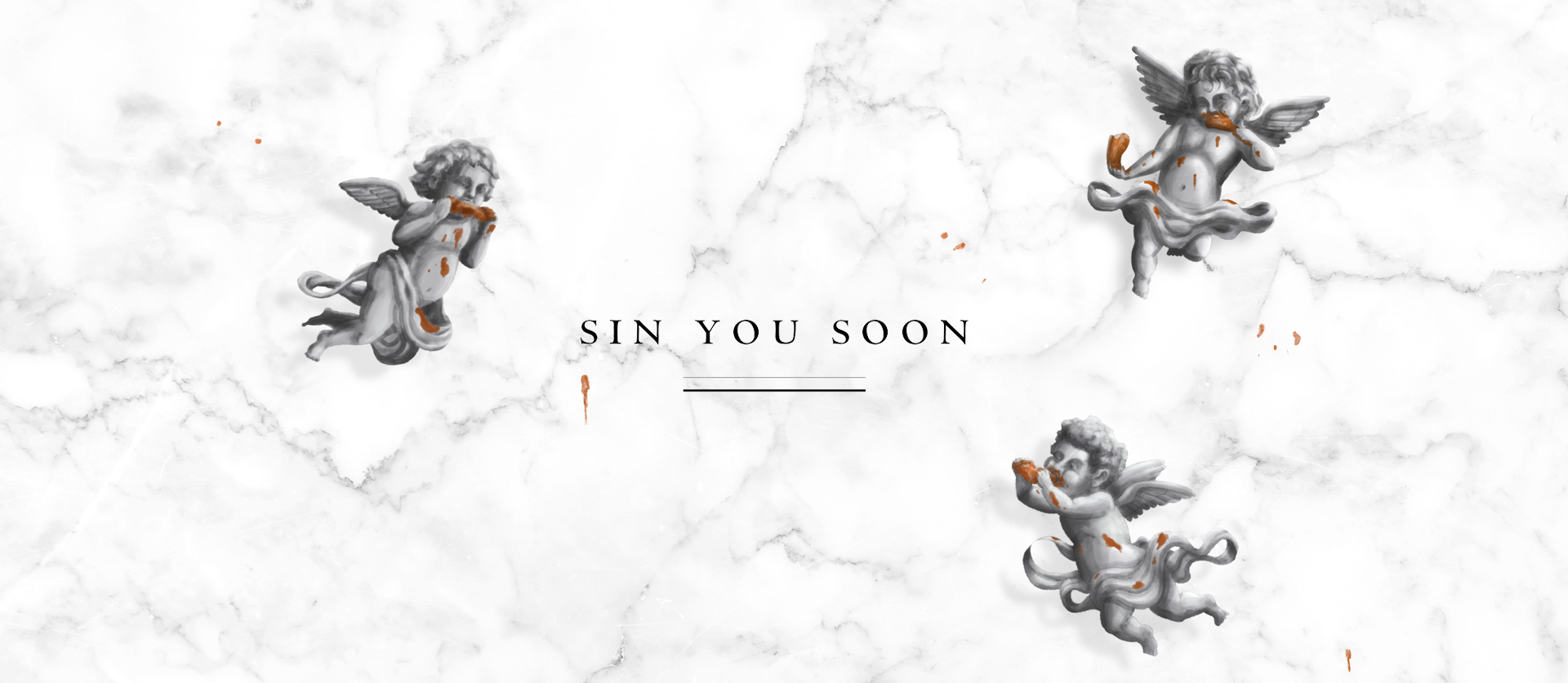
These cherubs are meant to be used at larger scale (billboards, food truck, etc.) while the cleaner brand icon is meant to exist at smaller scale and more closely associated with the logo mark. By pushing on the art direction style I was able to take the humor of the brand even further than before.
Brand Textures
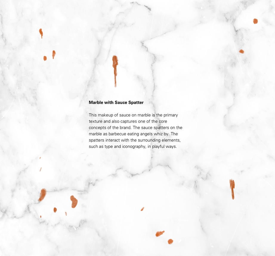
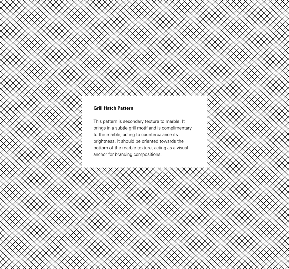
The two swatches below act as the textural backdrop to the brand identity in specific marketing communication scenarios.
Brand Textures
The two swatches below act as the textural backdrop to the brand identity in specific marketing communication scenarios.
Food Truck Design
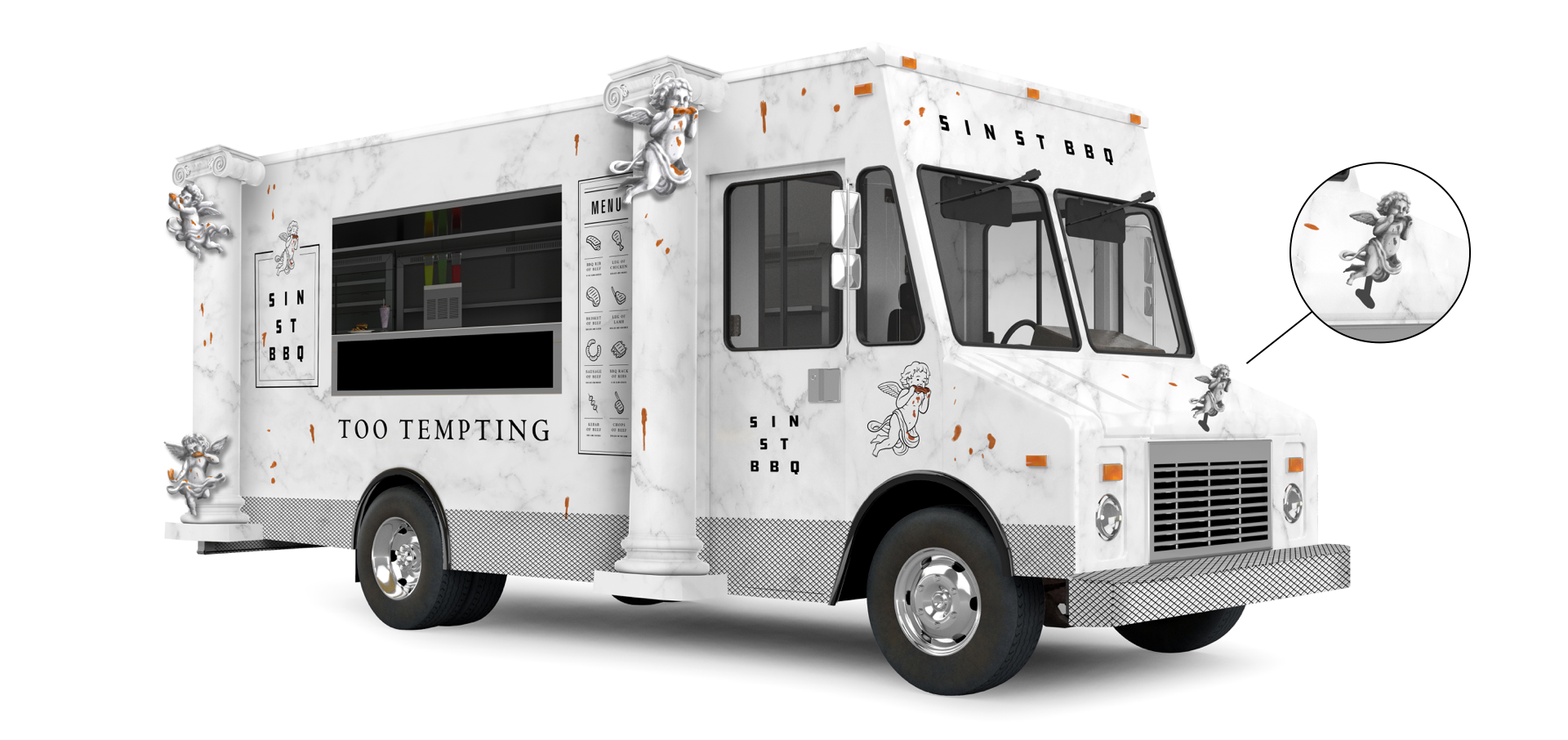
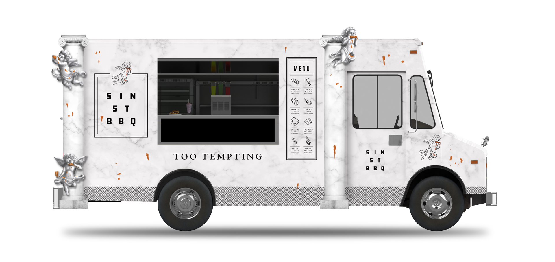
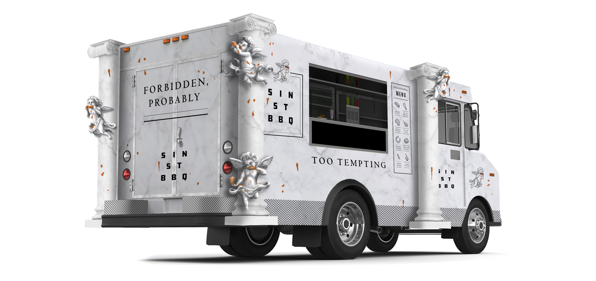
The SIN ST BBQ food truck is decked out with 3D sculptural cherubs affixed to (fake) marble columns on both sides of the truck as well as a chrome cherub hood ornament. This mobile meat station is sure to make a splash on the food truck scene.
Food Truck Design
The SIN ST BBQ food truck is decked out with 3D sculptural cherubs affixed to (fake) marble columns on both sides of the truck as well as a chrome cherub hood ornament. This mobile meat station is sure to make a splash on the food truck scene.
Packaging Design
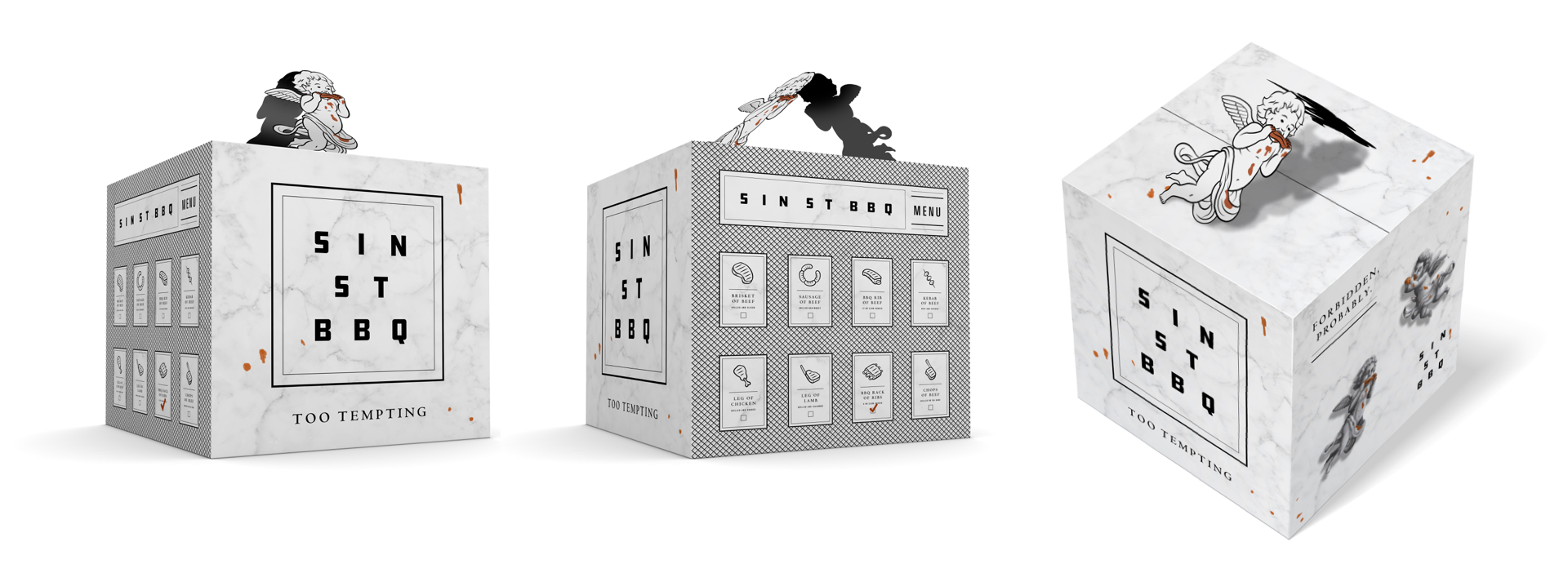
When designing the brand packaging, I tried to maintain elements of symmetry and solidity, treating the package as if it were actually a block of marble. To keep the brand icon hovering above the logo it’s being used as a pop-handle that rests on top.
Packaging Design
When designing the brand packaging, I tried to maintain elements of symmetry and solidity, treating the package as if it were actually a block of marble. To keep the brand icon hovering above the logo it’s being used as a pop-handle that rests on top.
Ordering App Design
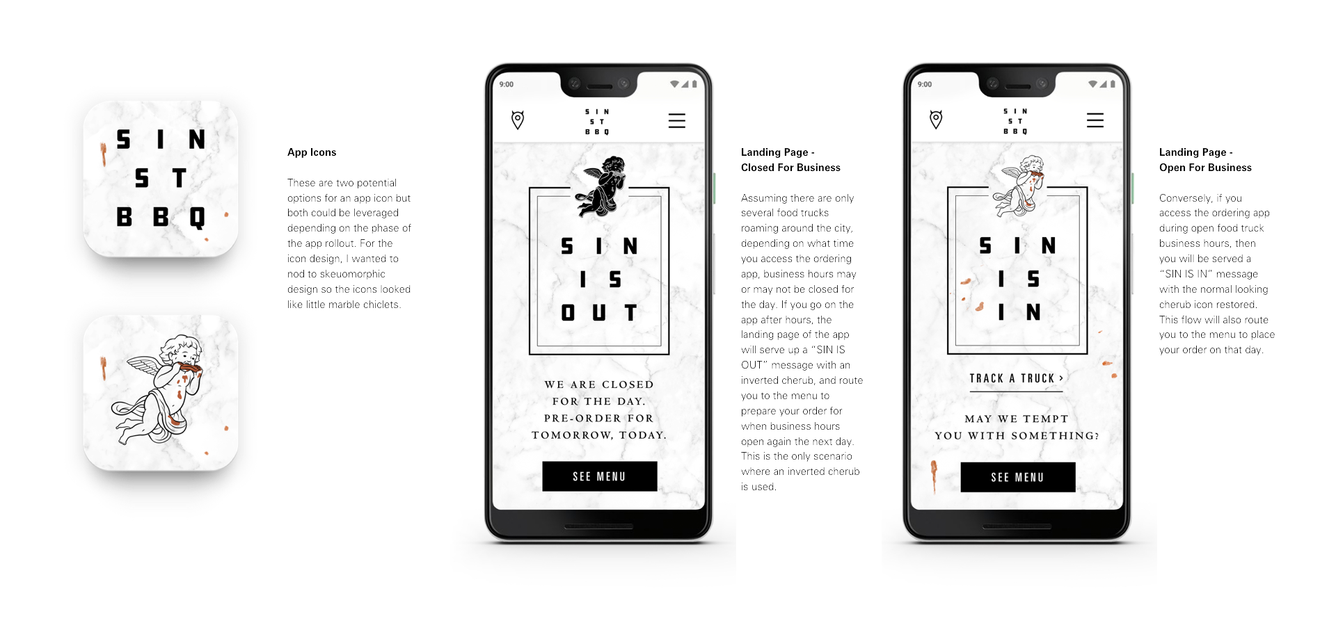
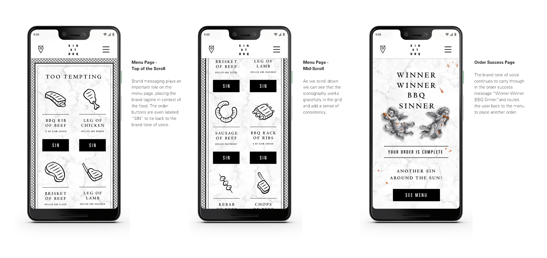
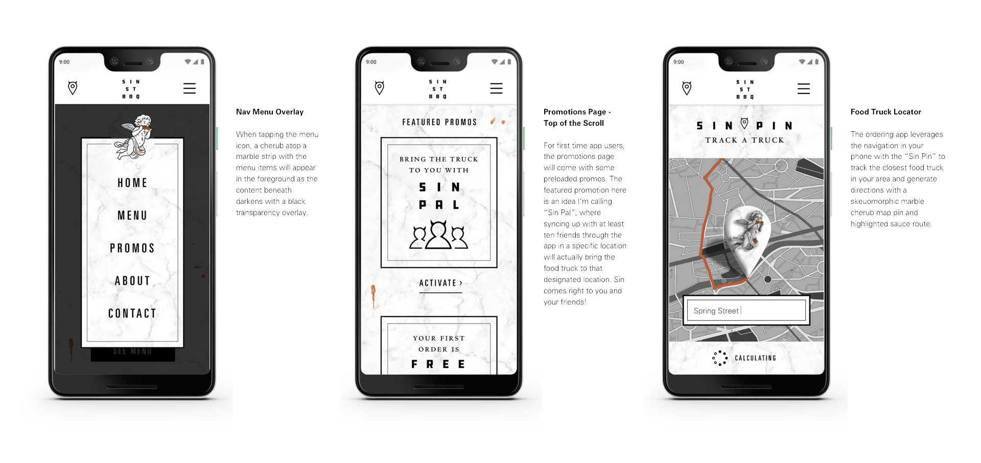
The ordering app is a key component of the brand ecosystem that ties almost all of the elements together to deliver a holistic, cohesive experience that’s reflective of the brand personality. In addition to a order purchase flow there are other unique features that also add new dimensions to the brand story. Here are a few designed screens from the app that capture some of the key features of the user journey.
Out-of-Home Executions
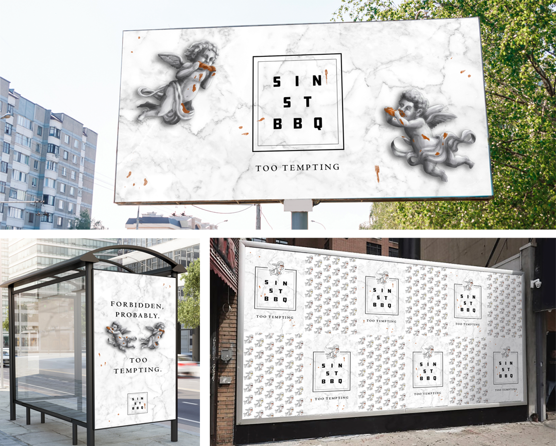
Here are some examples of how the brand extends to out-of-home media such as billboards, bus shelters and in wild postings. It’s out here in the world where you can truly start to see how the brand spreads its metaphorical wings through different brand asset combinations and placements.
Brand Apparel
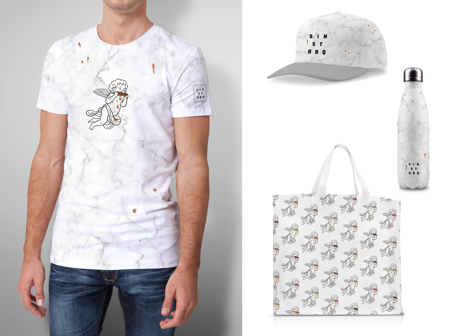
Exploring brand apparel design is a unique opportunity for deconstruction. Similar to Out-of-Home media, the brand can payoff in unexpected ways depending on the application. Brand elements can be mixed, matched, duplicated and separated endlessly depending on the assets at your disposal.
Print Identity
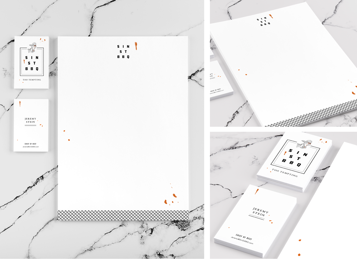
This light print identity exploration demonstrates how the reduction of brand elements can still capture its essence. This is characterized through the sparse sauce spatter motif and subtle use of the grill hatch pattern locked to the bottom of the letterhead.
Print Identity
This light print identity exploration demonstrates how the reduction of brand elements can still capture its essence. This is characterized through the sparse sauce spatter motif and subtle use of the grill hatch pattern locked to the bottom of the letterhead.
FEATURED PROJECTS

Who Deserves A Holiday Bonus?Campaign Development

Tax Like A BossCampaign Development

Kraken RumCampaign Development
New WorldsFilm Art Direction & Branding
Hilton ClubDigital Installation
Space RabbisNFT Collection
That Guy Who Ripped Off All Those PeopleFilm Art Direction & Branding
Patrón x BarsysPackaging Design
Stun LoveBrand Development
Mixes Best With AnythingCampaign Development
The Glass Doesn't Make The MartiniCampaign Development

Protein WorldCampaign Development
SIN ST BBQBrand & Identity
TidWitsIllustration Series
If My Mother Were A KangarooBook Design & Illustration
Movember KingCampaign Development
The Most Famous Coloring CookbookBook Design & Illustration

Jiffy LubeCampaign Development
Grilled DogsCampaign Development

Hell WeekBrand & Identity
Cheesy TotsCampaign Development
Chicken Fries Are BackCampaign Development
The AgencyComic Series
7UPCampaign Development
Balls on the LawnBook Illustration & Art Direction
The ReserveProgram Development
Mac n' CheetosCampaign Development
Tank Jet StudiosBranding & Identity
Jack Daniel's Tennessee FireCampaign Development
Brown Forman Admin OneDigital Installation
The DistilleryPhysical / Digital Installation
SunkistSocial Campaign
The HalfGraphic Novella

Crude CruisersIllustration Series
Brancas PitchPoster Design
Mine GamesGame Design
CONTACT / FOLLOW